- The Unexpected Relationship Between Stripes and Confidence at Home
For years, stripes have been one of decorating’s most reliable tricks. They’ve appeared on French mattresses, English wallpapers, Scandinavian textiles, and coastal cabanas. Yet despite their long history, stripes are having a particularly strong moment right now.
Designers are putting them everywhere—from painted ceilings and statement staircases to upholstered headboards and kitchen runners.
But why?
Part of the answer lies in aesthetics. Stripes are timeless. They’re versatile. They work in virtually every decorating style.
The more surprising answer, however, comes from psychology.
Research suggests that stripes can influence how we perceive space, process visual information, and experience our surroundings. While no study has ever concluded that stripes directly increase confidence, there is growing evidence that they contribute to many of the qualities we associate with confident interiors: clarity, intentionality, structure, and visual authority.
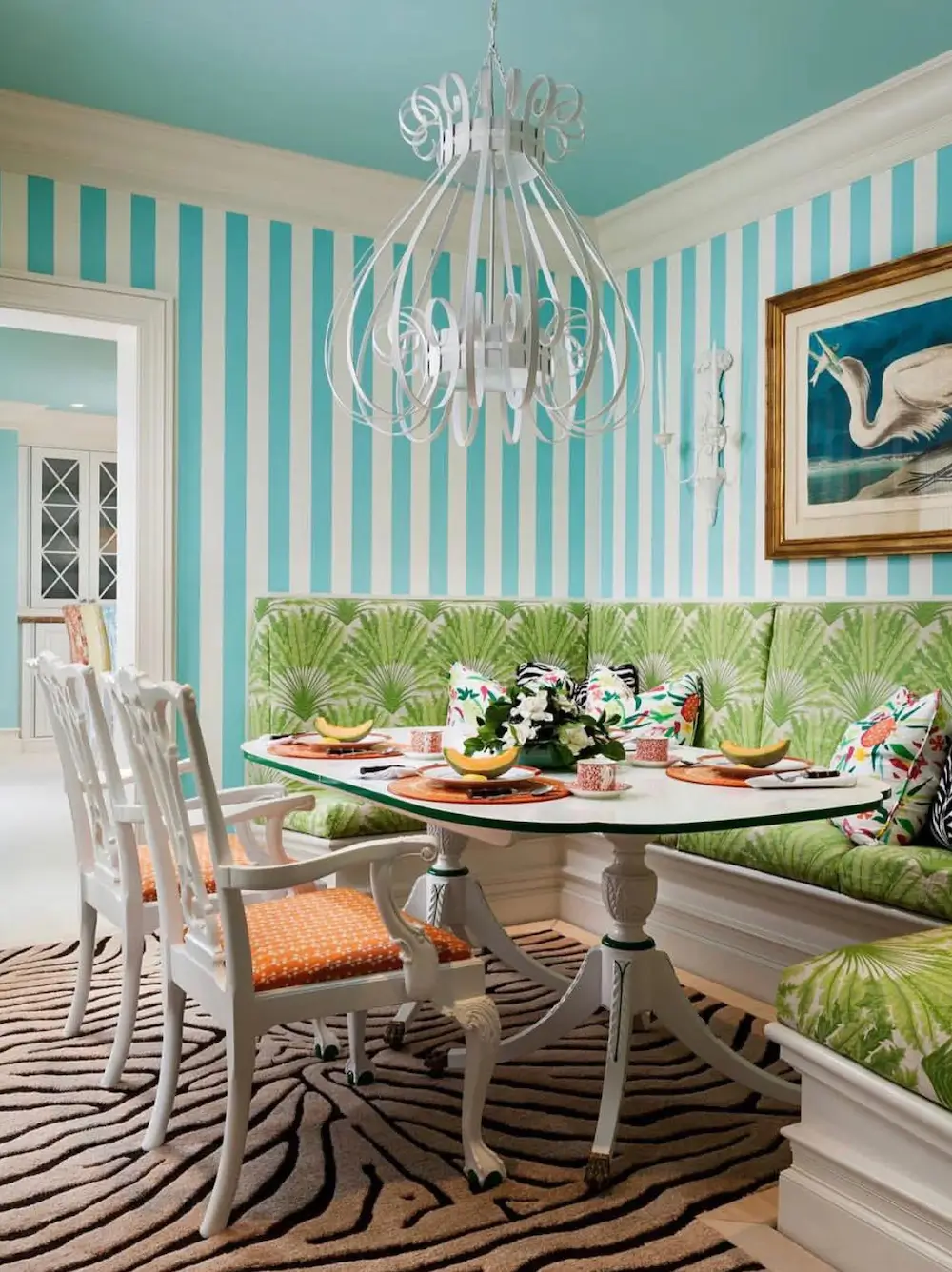
Our Brains Prefer Order More Than We Realize
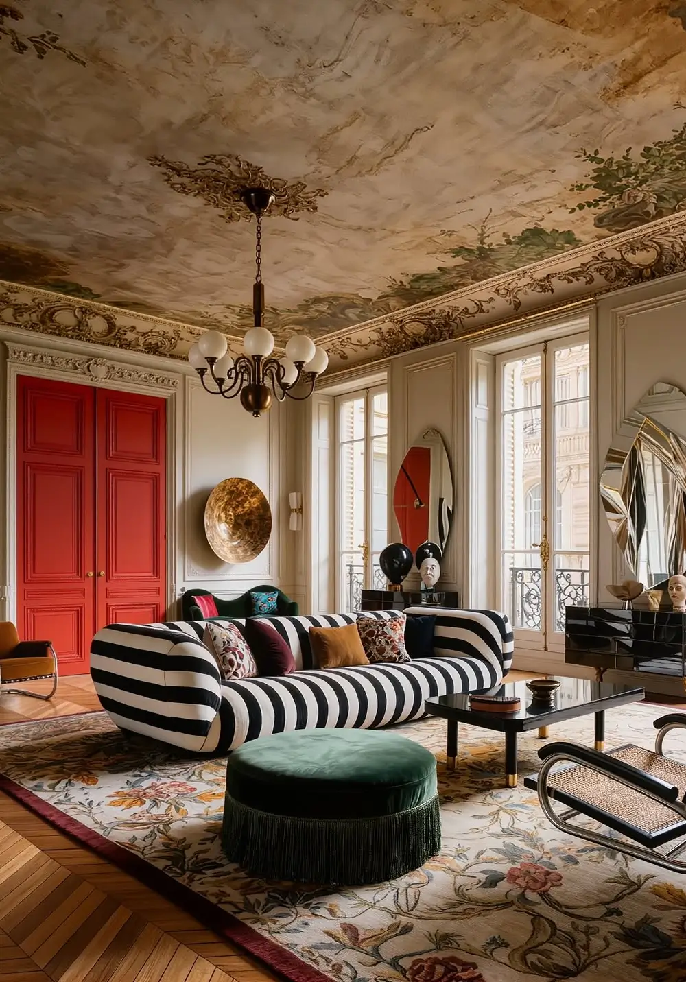
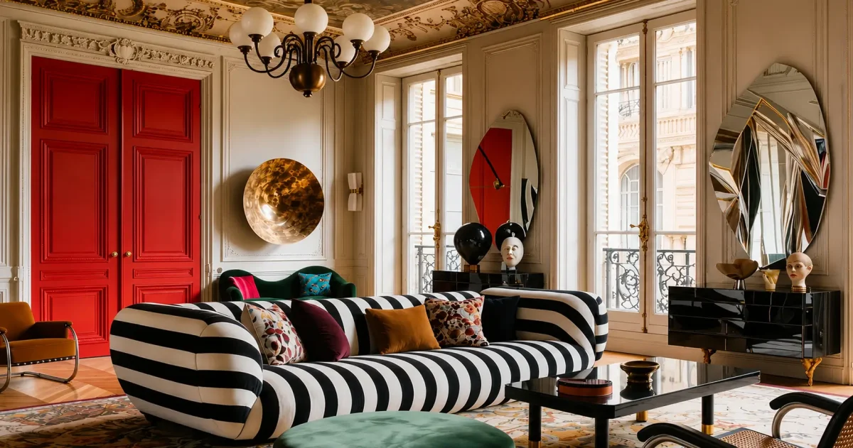
A dramatic striped sofa anchors this Parisian living room by NAIRA INTERIOR WORLD, proving how bold patterns can bring confidence and personality to a space rich in historic architectural details.
One of the most influential concepts in environmental psychology comes from researchers Rachel and Stephen Kaplan, whose work explored how people respond to built and natural environments.
According to the Kaplans’ Preference Matrix theory, humans tend to favor environments that balance complexity with coherence. In simple terms, we enjoy spaces that are interesting enough to hold our attention but organized enough to make sense immediately.
Stripes happen to satisfy both conditions.
They introduce pattern and movement while maintaining a highly predictable visual structure. Unlike more chaotic prints, stripes provide rhythm and repetition, making a room feel ordered rather than overwhelming.
This matters because environments that feel coherent are generally easier for the brain to process, reducing cognitive effort and creating a greater sense of comfort.
In decorating terms, that often translates into a room that feels calm, deliberate, and self-assured.
Stripes Can Change How We Perceive a Room
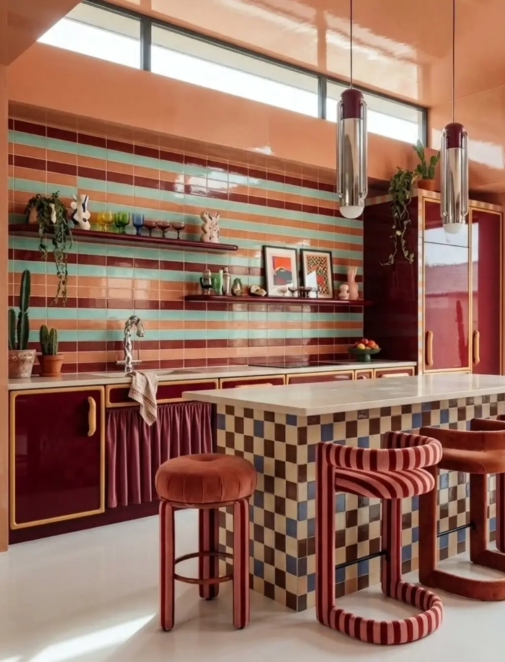
Retro candy hues, striped surfaces, and playful geometric patterns transform this kitchen (created and edited with Design Stream by MattoBoard) into a joyful celebration of color, texture, and nostalgia.
Perhaps the most fascinating research on stripes comes from Johannes Gutenberg University Mainz in Germany.
In a 2020 study published in i-Perception, researcher Eva von Castell and her colleagues investigated how wall patterns influence the perception of interior spaces.
Participants were shown computer-generated rooms featuring different wall treatments and asked to evaluate their dimensions.
The researchers found that striped wall patterns significantly influenced how people perceived room size. Certain stripe configurations made rooms appear larger than comparable spaces without patterns.
The study’s conclusion was striking: wall patterns do not simply decorate a room—they actively shape spatial perception.
For designers, this is hardly surprising.
For decades, decorators have used vertical stripes to emphasize height and horizontal stripes to enhance a sense of width. What is interesting is that scientific research now supports the idea that stripes genuinely affect how we experience a room, not just how we think about it.
A room that feels larger, taller, or more balanced often feels more confident as well.
The Science of Processing Fluency
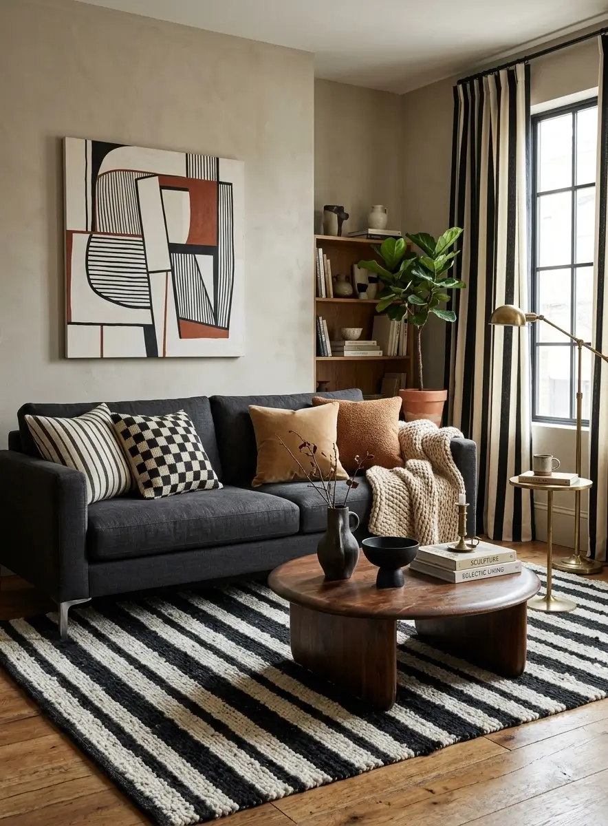
Black-and-white stripes bring structure and rhythm to this cozy modern living room, balancing soft textures, warm wood tones, and contemporary décor.
Another clue comes from the concept of “processing fluency.”
Psychologists Rolf Reber, Norbert Schwarz, and Piotr Winkielman proposed that people tend to prefer information that is easy for the brain to process.
Their 2004 review, published in Personality and Social Psychology Review, demonstrated that visual stimuli perceived with greater fluency are often judged as more attractive and pleasing.
Stripes are a textbook example.
Because they follow a predictable rhythm, our brains can quickly understand them. There is little ambiguity. We know where the pattern begins, where it continues, and how it repeats.
This doesn’t mean every striped room is automatically beautiful.
But it may help explain why stripes feel comfortable despite being visually bold.
They create excitement without creating confusion.
And that balance is surprisingly difficult to achieve.
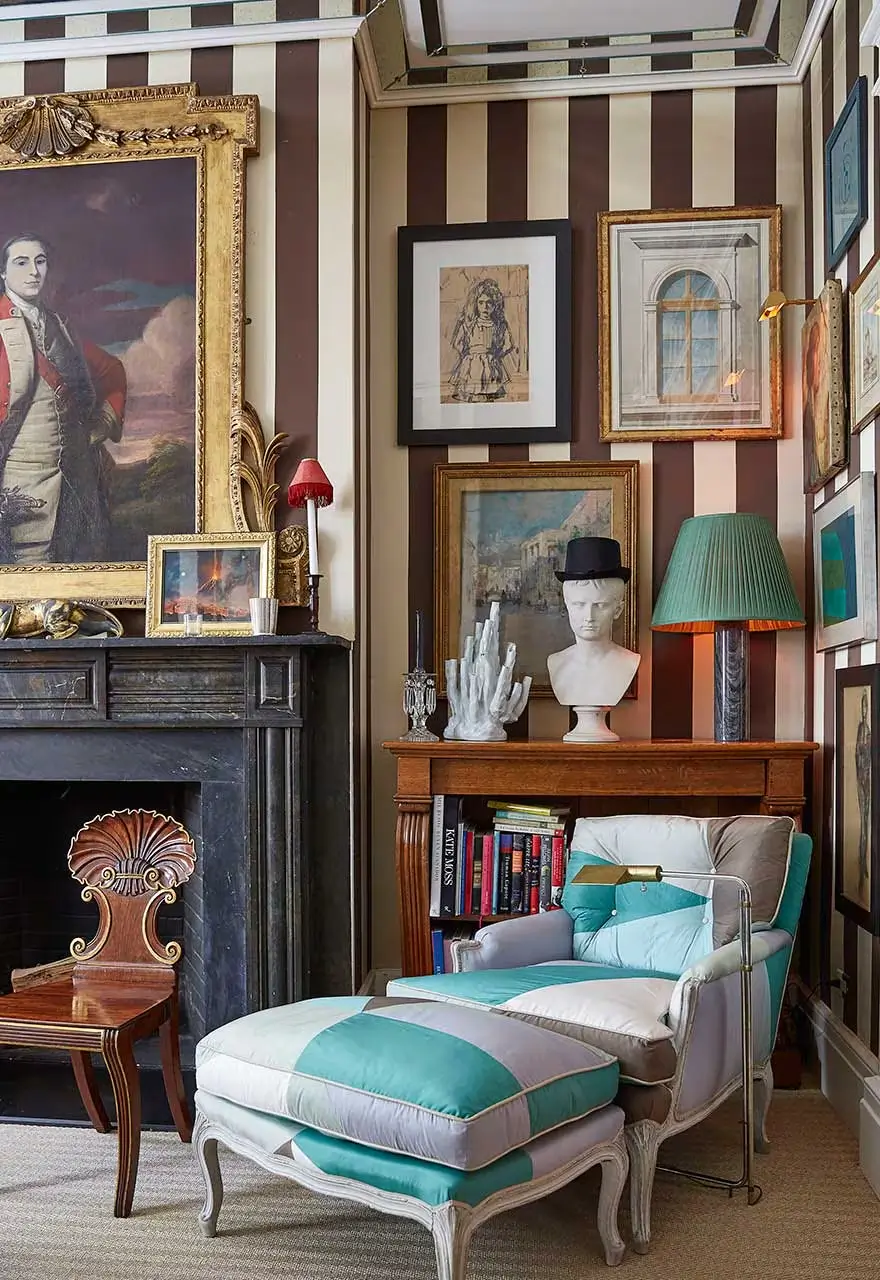
How Designers Tame Stripes
One of the biggest misconceptions about stripes is that they are difficult to decorate with. In reality, the world’s best designers have been using them for decades—but they rarely use them alone.
Dorothy Draper: Pair Stripes with Florals
The legendary Dorothy Draper became famous for oversized black-and-white stripes at The Greenbrier, but her real secret was contrast. She balanced strong geometric lines with oversized floral prints, allowing each pattern to soften the other.
Try it yourself: Pair a striped sofa with floral cushions or artwork to create a room that feels both structured and inviting.
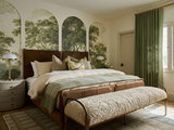
Mark D. Sikes: Limit the Color Palette
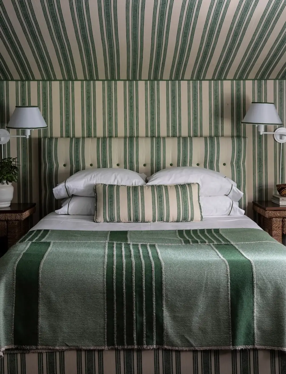
In this Bel Air guest room, designer Mark D. Sikes demonstrates the power of stripe drenching, using a classic green-and-white pattern across the walls, headboard, and bedding to create a cohesive and timeless retreat. The pattern feels very 1920s Old Hollywood and really helped unify the space.
Mark D. Sikes often layers stripes across walls, upholstery, and window treatments. The look never feels overwhelming because he typically sticks to a tightly edited palette—most famously green and white.
Try it yourself: If you’re repeating stripes throughout a room, keep the colors simple and consistent.
Miles Redd: Use Stripes as an Architectural Tool
Unlike Dorothy Draper’s high-contrast glamour or Mark D. Sikes’s perfectly coordinated stripe drenching, Miles Redd uses stripes to inject energy into a room. He often layers them with saturated colors, glossy finishes, and other bold patterns, creating spaces that feel collected, theatrical, and a little unexpected. The result is a masterclass in controlled maximalism—proof that stripes don’t have to be subtle to feel sophisticated.
How to Decorate with Stripes Like a Confident Designer
You don’t need to cover every wall in stripes to embrace the trend. Sometimes a single bold move is enough.
Make a striped armchair the focal point.
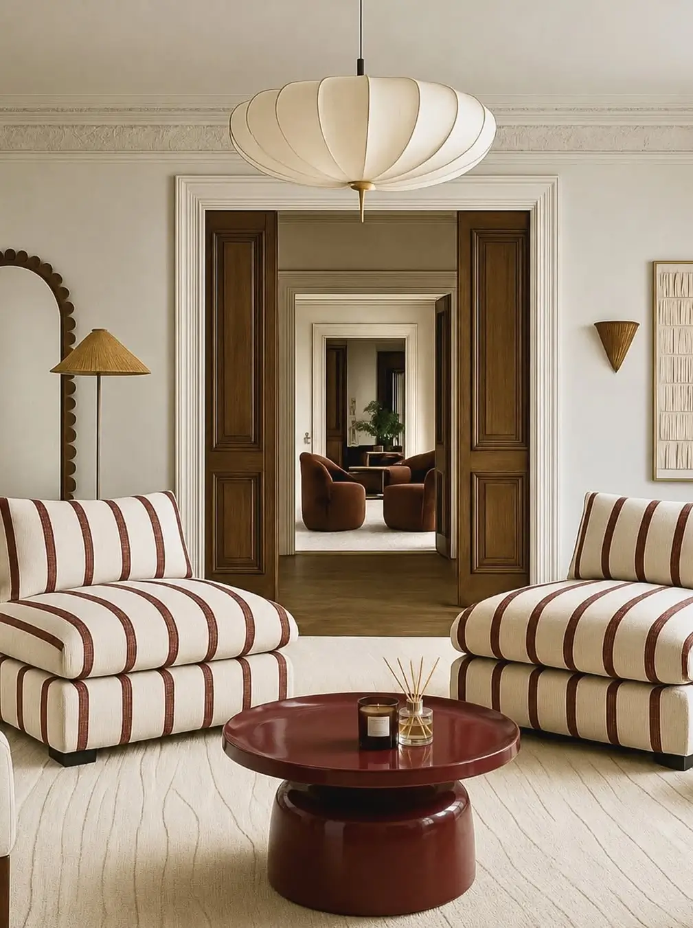
Image: La Época
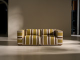
A cream-and-burgundy, green-and-cream, or terracotta-striped sofa instantly becomes the room’s hero piece, adding personality and visual rhythm.
Think beyond the walls
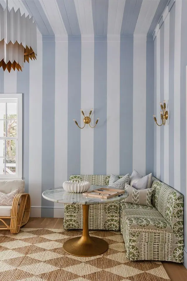
Designed by Megan Molten Interiors, this charming seating corner uses oversized blue-and-white stripes to add height, freshness, and a subtle sense of drama to a relaxed coastal space.
Designers increasingly treat the ceiling as the “fifth wall.” Painted stripes overhead can transform an ordinary room into a memorable architectural statement.
Start Small
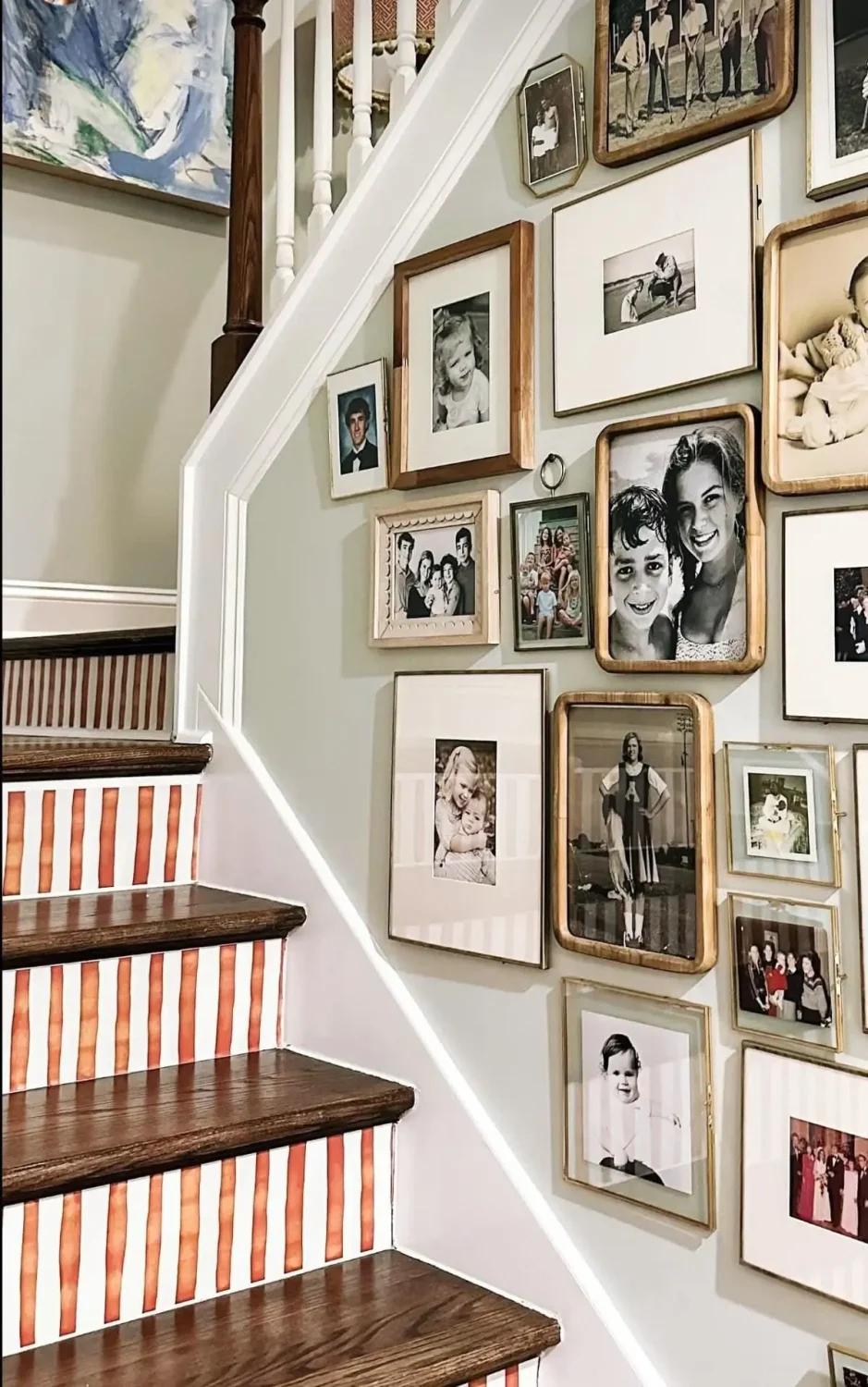
Not ready for a striped sofa or ceiling? Painting stripes on stair risers is a playful way to introduce pattern and personality without overwhelming a space.
Not every striped interior begins with a statement sofa. Sometimes the most successful applications are the most unexpected. Stair risers, cabinet interiors, window shades, and accent furniture offer low-commitment ways to introduce stripes while adding rhythm and personality to everyday spaces.
Choose colors that feel confident
Some stripe combinations have a particularly strong presence:
- Deep green and cream
- Terracotta and soft blue
- Burgundy and blush
- Chocolate brown and ivory
- Navy and white
- Black and white
The most successful striped interiors aren’t necessarily the boldest. They’re the ones that use contrast, rhythm, and repetition with intention.
The Real Connection Between Stripes and Confidence
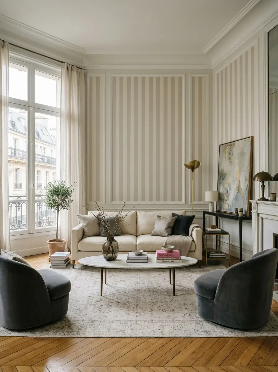
Soft striped wallpaper adds depth and refinement to this serene Parisian living room, proving that stripes can be just as impactful when used with restraint.
No scientific study has ever proven that striped wallpaper makes people more self-confident.
What the evidence does suggest is something arguably more interesting.
Research from environmental psychology shows that people respond positively to coherent environments. Studies from Johannes Gutenberg University Mainz demonstrate that stripes can alter spatial perception. Processing fluency theory suggests that predictable visual patterns are easier—and often more pleasurable—for the brain to process.
Together, these findings help explain why stripes often make a room feel stronger, clearer, and more intentional.
And perhaps that’s what confidence in design really is.
Not showing off.
Not following trends.
Simply making a choice—and owning it.
The post The Unexpected Relationship Between Stripes and Confidence at Home appeared first on Decoholic.
- A Warm and Inviting Stockholm Home with a Lived-In Feel
 I’m writing this as we head down the motorway, heading back to Malmö after a wonderful Midsummer weekend at our cottage. There were wildflowers in our hair, garden games on the lawn and a long, leisurely feast outdoors, scenes not unlike those I shared with you last Thursday.
As we settle back into city life, I thought we’d take a peek inside an apartment in the heart of Södermalm, Stockholm. While the setting is urban rather than rural, there’s something about this home that feels equally relaxed and inviting. Perhaps it’s the warm earthy palette, the well-used kitchen, or the way everything appears collected over time.
This Södermalm apartment has that lived-in look, thanks to the open shelving, wooden island worktop, aged cutting boards, visible cables and tactile textiles that bring warmth and character.
What I love most is the unpretentious approach. Open shelves lined with everyday glassware and pantry staples rather than carefully styled displays, and earthy shades of olive green, ochre and rust add depth throughout. Art, plants and vintage finds lend a personal touch to the rooms, creating a home that feels creative, practical and welcoming.
Let’s take a closer look.
.jpg)


A rare peek into a bathroom on here! I was drawn to this one because although it is simple and unfussy, with exposed pipework, classic white tiles and straightforward fittings, it’s a great example of how you can elevate a practical space without spending a fortune. A striking shower curtain, nice towels, artwork, baskets, a few hooks, a plant and a pretty robe all help to add personality and warmth.
All in all, there are plenty of ideas to steal from this lovely Stockholm home, do you agree? Is there anything that caught your eye?
I hope you enjoyed the tour!
Here are a few more Scandinavian apartments to feel inspired by today:
Ha det så bra!NikiPhotography courtesy of Historiska Hem, with thanks. - Giveaway: You Could Win $10,000 In Luxury Patio Furniture
You Could Win $10,000 in Luxury Patio Furniture
The post Giveaway: You Could Win $10,000 In Luxury Patio Furniture appeared first on House & Home.
- Warm Finishes and Pleasing Proportions Transform a Primary Bath (8 photos)
As they entered the empty-nest phase of life, these Treasure Valley, Idaho, homeowners decided it was finally time to tackle the primary bathroom renovation they had envisioned for years. They hired contractor Anthony Boyd of Boyd Remodeling and Construction and interior designer Lauren Lienhard to bring…
- Before and After: 4 Inviting Kitchens in 165 to 225 Square Feet (12 photos)
Kitchens measuring 165 to 225 square feet hit a Goldilocks sweet spot: large enough to accommodate generous storage, ample work surfaces and sought-after features, yet compact enough to feel efficient and easy to navigate. In these four before-and-after makeovers, design and remodeling pros…

- 12 Outdoor Living Standouts From Spring’s Top Furniture Markets (12 photos)
This spring’s International Contemporary Furniture Fair (ICFF) and High Point Market trade events showcased a wave of fresh thinking in outdoor design, with innovative materials, refined craftsmanship and modern forms bringing new options for patios, decks, balconies and beyond. Sustainability, advanced…

- 6 Pro Tips for Managing Conflict on the Job (6 photos)
Whether it’s a misunderstanding with a customer or a disagreement with a team member, challenging situations are part of running a business. Of course, the best solution is to prevent them from happening in the first place. But if they do occur, the key is to resolve them with grace and dignity to ensure…


- Happy Midsummer!
 Just popping in to wish you a very happy Midsummer’s Eve! Here in Sweden, the revelry is about to begin with dancing around the maypole, followed by a party at friends’ where we’ll tuck into herring, salmon, quiche, new potatoes and strawberries, all washed down with beer and schnapps. There’ll be plenty of singing around the table too, before we chat (and dance!) into the small hours. Best of all? The sun is shining on Sweden today! Hurrah!
 I hope you have a ‘glad midsommar’ too!NikiThese beautiful pictures are by Elin Lannsjö – and I felt they captured the spirit of a Swedish midsummer perfectly.
 - 4 Stylishly Moody New Bedrooms (4 photos)
A moody bedroom can create a sense of comfort, intimacy and escape that’s hard to achieve with a lighter palette. Deep colors, rich materials and layered textures help envelop a space while adding character and sophistication. In these four bedrooms, designers share how they used dark hues,…
- The “Salad Method” Might Be the Best Decorating Advice We’ve Heard in Years
There are two kinds of homes that instantly feel a little off.
The first is the house that looks like it came straight out of a furniture catalog, where every piece appears to have arrived in the same truck on the same day.
The second is the house that’s trying very, very hard to be a specific style. French Country. Mid-Century Modern. Coastal Grandmother. English Cottage. Pick your label.
And while there’s nothing wrong with loving a particular aesthetic, legendary interior designer Bunny Williams believes that true personal style doesn’t come from committing to a single decorating tribe.
Instead, she compares it to making a salad.
Yes, a salad.
Speaking with House Beautiful‘s Director of Special Projects Carisha Swanson, Bunny Williams explained her approach:
“You make your own recipe for it and you pick something from here, and you don’t want to overdo anything.”
It’s such a simple analogy, but it perfectly captures why some interiors feel deeply personal while others feel like they’re wearing a costume.
Why a Single Style Can Feel Limiting
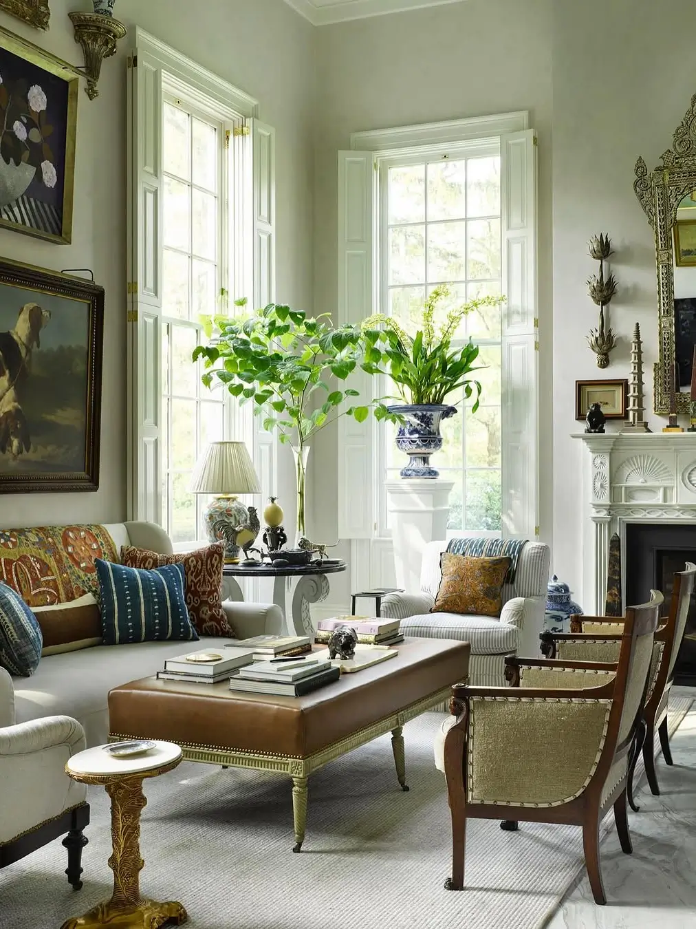
This light-filled sitting area by Williams Lawrence demonstrates Bunny Williams’ “Salad Method” of decorating, where antiques, artwork, botanical elements, and comfortable furnishings are thoughtfully mixed to create a room that feels collected rather than styled.
One of the most common mistakes people make when decorating is assuming they need to choose a design identity and stick to it religiously.
Suddenly they’re asking questions like:
- Can I mix modern lighting with antique furniture?
- Is this chair too traditional for my contemporary living room?
- Would this artwork work in a coastal house?
The answer is almost always yes.
Williams has long championed rooms that evolve naturally over time. The homes she designs rarely fit neatly into one category. Instead, they feel collected, layered, and lived in.
Not because they’re following a trend, but because they’re reflecting the people who live there.
A house filled exclusively with one style can sometimes feel like a movie set or a museum period room. Beautiful? Absolutely. Personal? Not always.
Think Like a Chef, Not a Decorator
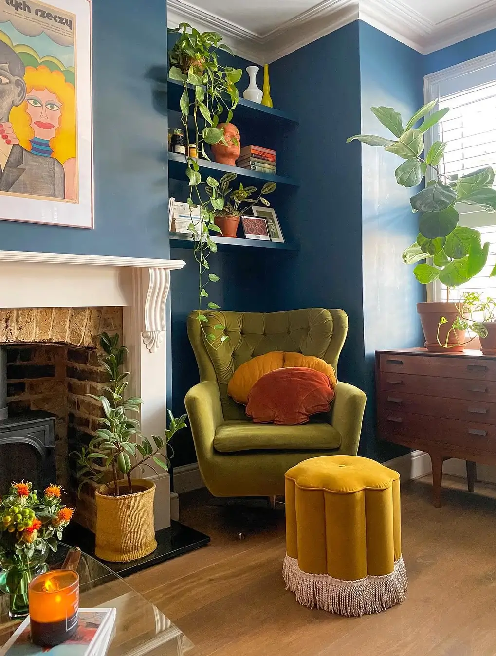
This cozy corner in Ola Zwolenik‘s home perfectly illustrates the “Salad Method” of decorating, mixing bold wall color, vintage-inspired furniture, lush greenery, and playful textiles to create a space full of personality and warmth.
The genius of the Salad Method is that it shifts the conversation away from labels.
Instead of asking, “What style am I?”
Ask:
- What do I genuinely love?
- Which pieces have meaning to me?
- What colors make me feel comfortable?
- What objects have I collected over the years?
Just as a good salad isn’t made from twenty ingredients fighting for attention, a successful room isn’t about cramming in every trend you like.
A little vintage.
A little modern.
Something inherited.
Something handmade.
Something unexpected.The magic happens in the mix.
Mixing Materials, Not Matching Them
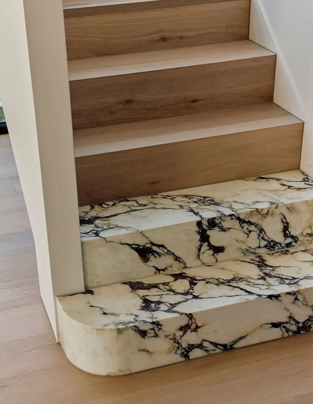
One of the easiest ways to create a home that feels collected rather than predictable is to embrace material contrast. At the Ormond Residence by Alesi, the warmth of Dune oak flooring is paired with the bold veining of Calacatta Viola marble, creating a staircase that feels both grounded and dramatic. It’s a perfect example of Bunny Williams’ “Salad Method” in action: combining different elements that might not traditionally match but work beautifully together. The result is a space with more depth, character, and visual interest than any single material could achieve on its own.
The Takeaway: Stop Decorating by Category
If you’ve been struggling to define your decorating style, Bunny Williams offers a refreshingly liberating alternative:
Don’t.
Instead of chasing a label, start collecting ingredients.
Mix old with new.
Mix formal with casual.
Mix things that make you happy.Just don’t overdo any one thing.
Because the most interesting homes aren’t the ones that perfectly represent a single aesthetic.
They’re the ones that tell the story of the people living inside them.
And according to Bunny Williams, that’s exactly what good decorating should do.
The post The “Salad Method” Might Be the Best Decorating Advice We’ve Heard in Years appeared first on Decoholic.
Dream House Villa İnterior And Exterior Design

.jpg)


Ready To Start New Project With Intrace?
You can reach detailed information about the services we offer within the body of Architecture, and you can contact us with any questions you may have.
We want you to know that we will be happy to answer your questions. Contact us to get detailed information about our work and to see what we can do for you.